


Maximising Website Enquiries: A Comprehensive Guide
While having an online presence is essential, converting website visitors into actual inquiries requires a strategic approach. In this article, we will explore effective ways to en


While having an online presence is essential, converting website visitors into actual inquiries requires a strategic approach. In this article, we will explore effective ways to en

There are various grants and funding opportunities available in Ireland to support website development and other digital initiatives. However, the availability of specific grants c
Two fantastic options for creating and overseeing e-commerce websites are WordPress and Shopify. Each platform boasts distinctive features and capabilities, tailored to diverse nee
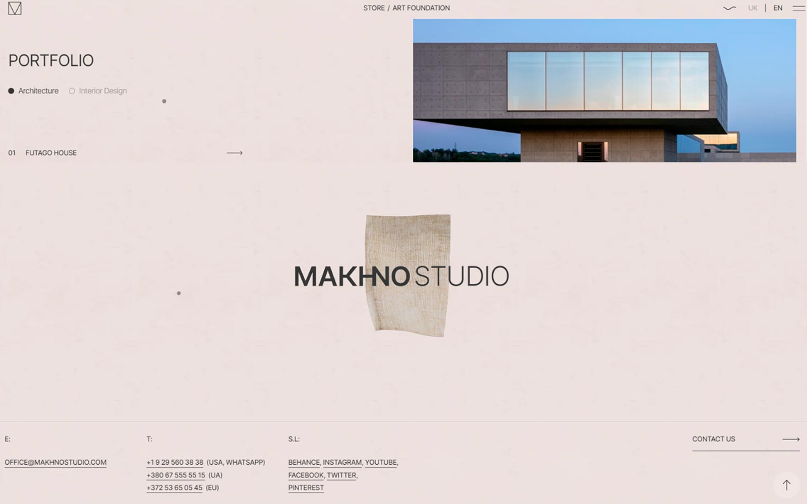
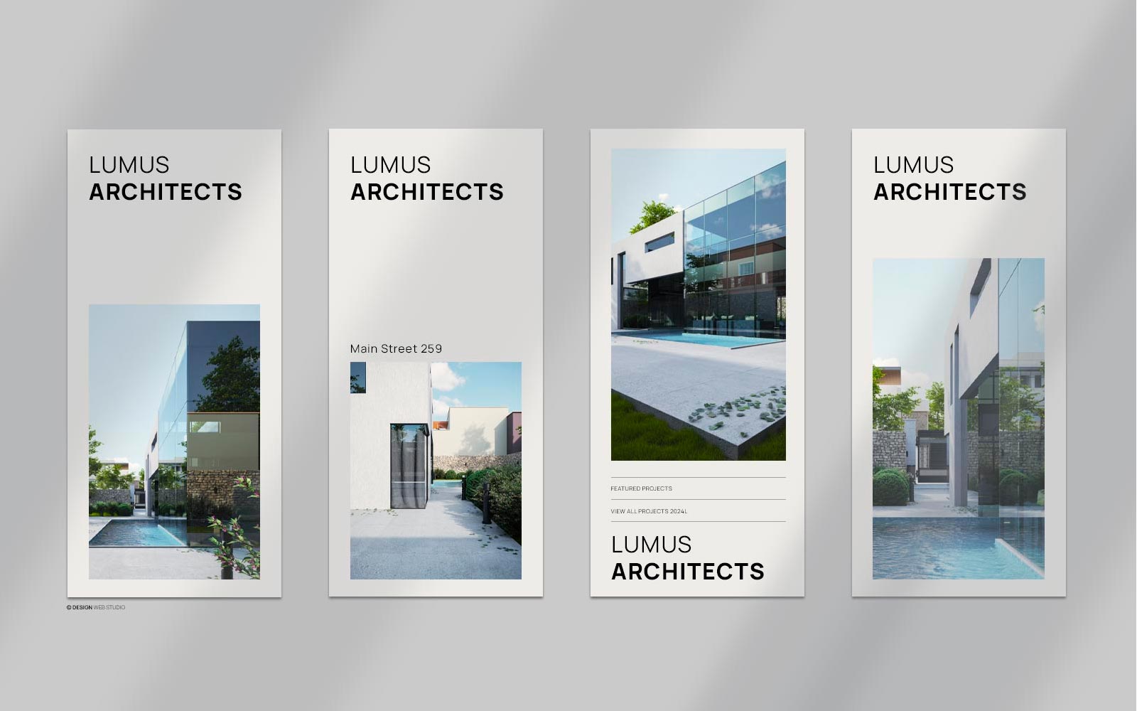
Just as a well-designed building seamlessly integrates with its surroundings, an exceptional website should harmonise with its content and purpose. We’ll examine how these we
Print design remains an essential facet of graphic design that encompasses various mediums such as brochures, posters, magazines, and packaging. Unlike digital design, print materi
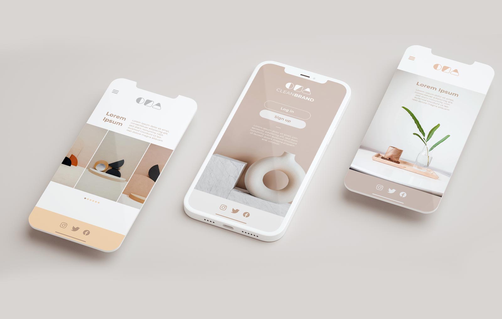
Simple web design not only enhances user experience but also fosters a sense of clarity, elegance, and efficiency. Let’s explore the art of keeping it simple in web design an

A visually engaging and aesthetically pleasing design not only captures the attention of visitors but also helps in building a strong brand identity. By incorporating a cohesive de
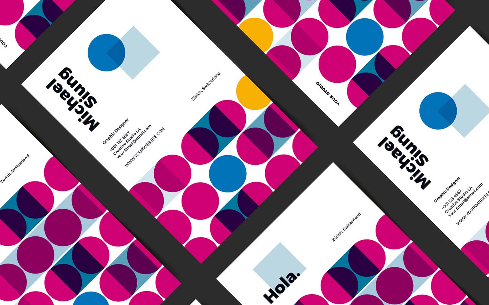
A brand style guide is an indispensable tool for ensuring consistency and coherence in how a brand presents itself to the world. It serves as a foundation for brand identity, empow
In the world of web design, creating an aesthetically pleasing and functional website is paramount. However, the most successful web designers understand that design goes beyond ae

Whether it’s a corporate office, a museum, a retail store, or a public park, the design of these spaces has a profound impact on our well-being and how we perceive and intera
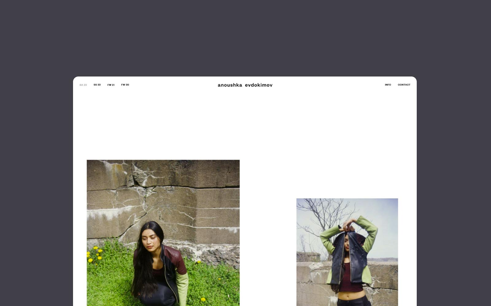
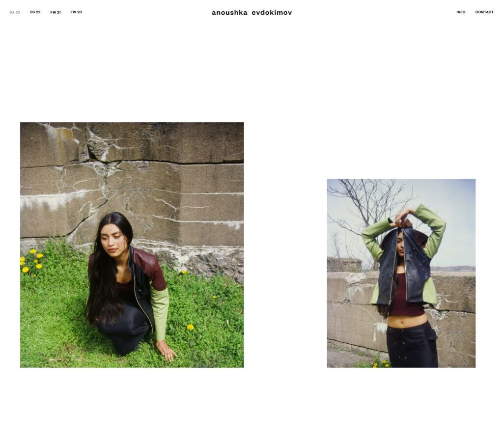
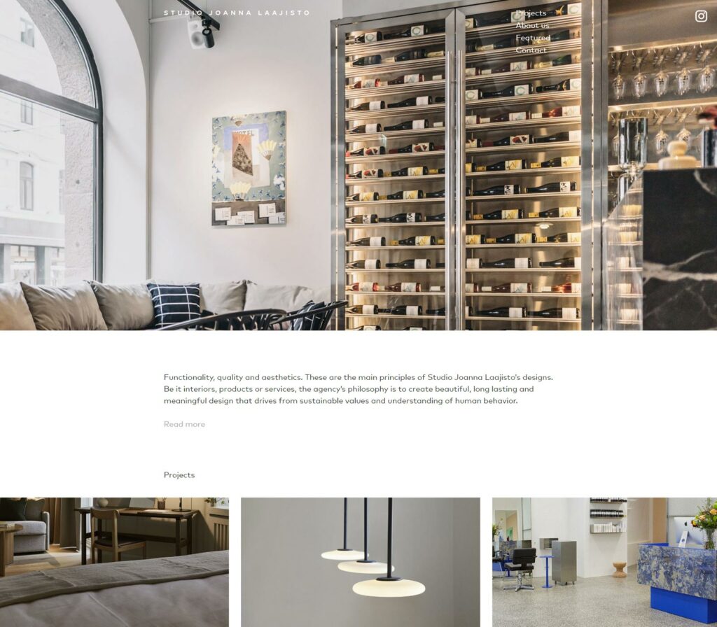
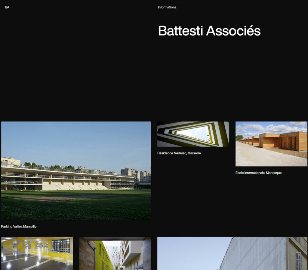
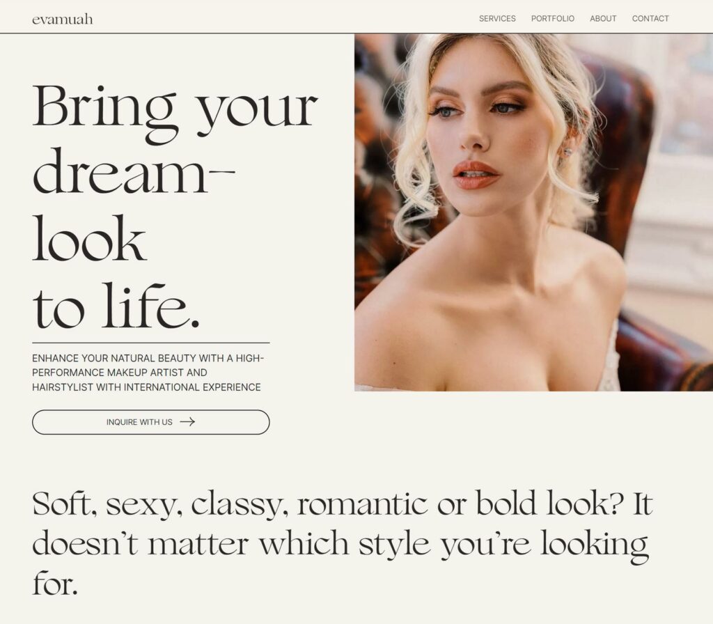
Minimal website design Examples A Brief Introduction to Minimal Website Design & Some Examples Fashion minimalistic design Grid-based minimalistic website Minimal Makeup &
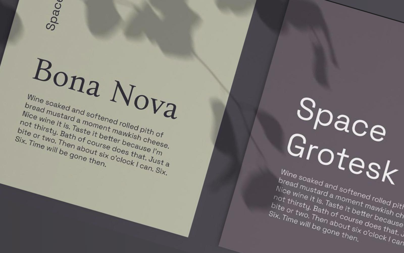
Font Pairings For Brand Ten featured font pairings to enhance your website brand Fonts are a crucial part of any design, and the right pairing can make all the difference. But wit
![]()