Design Web Studio
Free action plan

Proof

Harmony Sedation
Brand Guidelines

Harmony
Sedation

Mobile Dental Sedation Services
Version 1.0September 2026Two colour directions for review
Cover image — macro organic, halcyon to gold

01 — Cover

Contents
02 / 18
The fixed system
03Positioning and audiences
04The brand idea
05The mark, anatomy
06Lockups
07Clearspace and minimum size
08Colour: the palette
09Colour: contrast and legibility
Open for decision
10Direction A — Navy-led
11Direction B — Halcyon-led
12The two compared
13Typography
14Graphic devices
15Photography
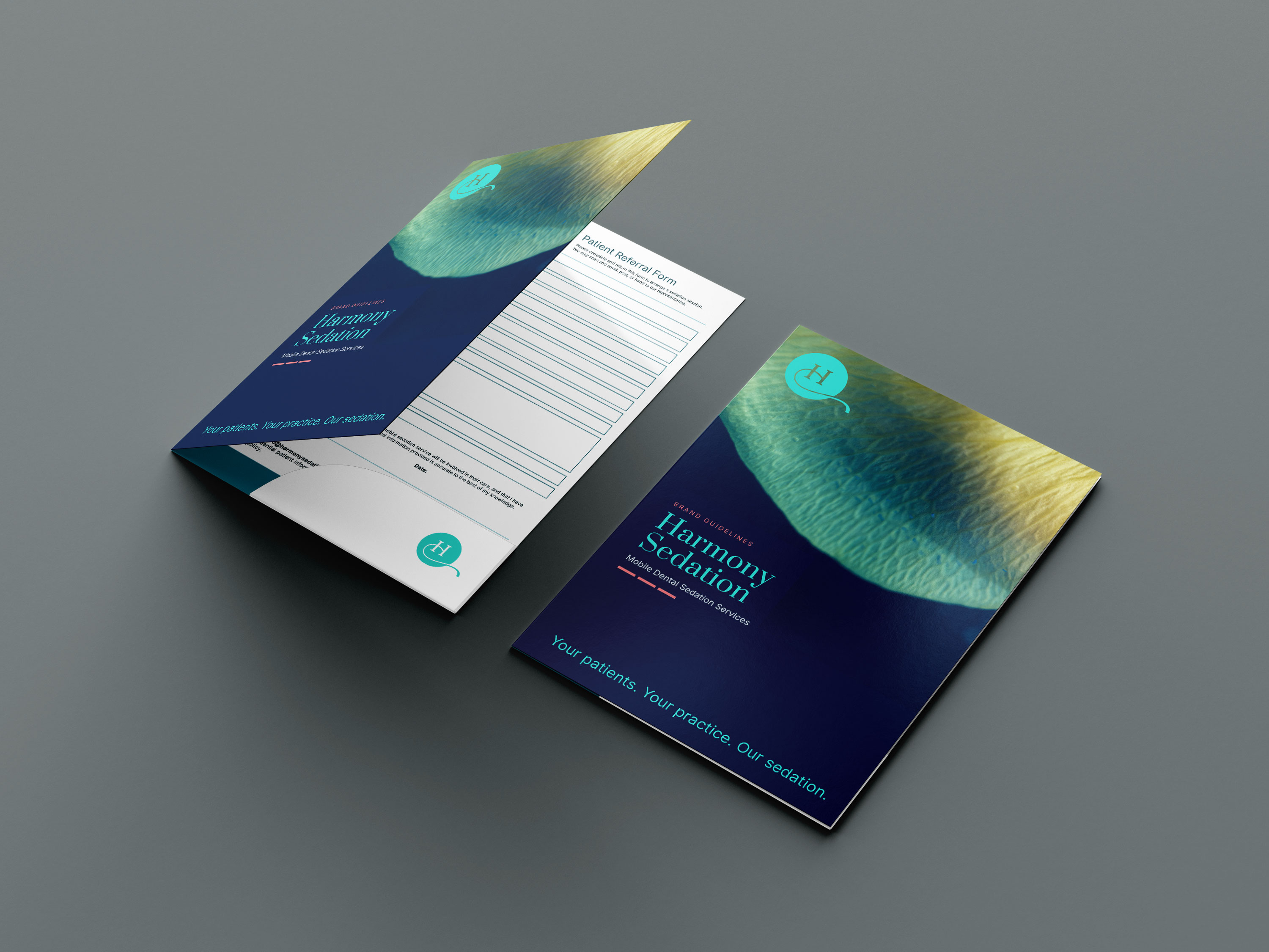
16The referral pack
17Website and social
18Contacts

02 — Contents

Positioning
03 / 18

A mobile conscious sedation service that works alongside the practice, not in place of it.

Referring dentists
Expand the service offering with no capital outlay. Sedation arrives; the treatment, the patient and the revenue stay in the practice.
Anxious patients
Treatment in a familiar surgery with a familiar dentist, without a hospital referral. Calm, monitored, and over in one visit.
Suppliers and agencies
One palette, one typeface, one mark with fixed clearspace. Everything needed to produce print without a proof cycle.

03 — Positioning

The brand idea
04 / 18
Your patients. Your practice. Our sedation.
Collaborative. The referring practice is never displaced.
Composed. Clinical competence shown, never claimed loudly.
Complete. Equipment, consent, monitoring, discharge, records.

04 — Brand idea

The mark
05 / 18
Harmony Sedation mark
DiscSolid halcyon, never outlined and never gradated. The disc is the constant; it is what reads at 12mm on a referral pad.
Serif HA high-contrast serif inside an otherwise sans-serif system. It is the only serif the brand uses, and only ever inside the mark.
Escaping strokeThe curve leaves the disc to the right and terminates flat. Never crop it, never let another element sit within its sweep.
ReversalOn navy the disc stays halcyon and the H and stroke go white. On halcyon the whole mark goes navy.

05 — The mark

Lockups
06 / 18

Harmony
Sedation
Mobile Dental Sedation Services
HorizontalLetterhead, email signature, web header, forms.

Harmony
Sedation
Mobile Dental Sedation Services
StackedCovers, folders, pull-up banners, signage.

Mark aloneAvatars, vehicle livery, folder pockets, stamps.

06 — Lockups

Clearspace and minimum size
07 / 18

Clearspace equals one disc radius (½ x) on every side, where x is the disc diameter. Nothing enters it — no rule, no type, no image edge.
Print — 18mm wide
Print minimum — 12mm
Screen minimum — 40px
Below the minimum the serifs on the H close up and the stroke breaks. If the space is smaller than 12mm, set the wordmark alone instead.

07 — Clearspace

Colour
08 / 18
Harmony Navy#01204D · C100 M85 Y35 K35
Ground, body text on paper
Harmony Halcyon#2FCEC5 · C68 M0 Y28 K0
The mark, headlines on navy
Harmony Coral#EA7D82 · C0 M60 Y40 K0
Emphasis, dashes, subheads
Harmony Paper#F5F6F6 · uncoated stock
Documents, forms, web body
Coral is emphasis, never a field. It appears as the three dashes, as a subhead, or as a rule — never as a background behind body copy.

08 — Palette

Contrast and legibility
09 / 18
Approved pairings
Halcyon on navy8.1 : 1 · any size
Paper on navy14.6 : 1 · any size
Navy on paper14.0 : 1 · any size
Navy on halcyon7.4 : 1 · any size
Restricted
Halcyon on paper1.8 : 1 · never for text
Coral on paper2.6 : 1 · 30pt and above
Deep halcyon on paper4.6 : 1 · use for body
Deep coral on paper4.9 : 1 · use for body
On paper, use the deep steps for anything set below 30pt. Patient-facing documents follow this without exception — consent and aftercare copy is navy on paper.

09 — Contrast

Direction ANavy-led · 70 / 25 / 5
10 / 18

10 — Direction A — Navy-led

Direction BHalcyon-led · 55 / 35 / 10
11 / 18

Halcyon and paper carry it. Navy becomes the ink.

Halcyon fields open documents and sections; navy does all the reading work. Coral widens slightly to carry callouts and step numbers. Patient-facing pieces stay light throughout.
Strength. Calmer for patients, cheaper to print, better on screen.
Risk. Reads softer; halcyon fields need navy type to stay legible.

Referral pack
Mobile Dental Sedation Services
Interior page
Halcyon rules and step numbers, navy type, coral for callouts.

11 — Direction B — Halcyon-led

The two compared
12 / 18
 
Referring dentists
Anxious patients
Print cost
Screen and social
Signage and livery
A · Navy-led
Strong. Reads established and clinical.
Cooler; can read institutional.
Heavy coverage on uncoated stock.
Dark UI needed throughout.
Excellent — halcyon mark pops on navy.
B · Halcyon-led
Current and approachable; less commanding.
Strong. Calm without being clinical.
Lighter; better on recycled stock.
Strong. Light UI, navy type.
Good, but the mark needs a navy reversal.
Recommendation
Run Direction A for anything a dentist holds — folder, cover letter, referral form — and Direction B for anything a patient reads, plus the website. One palette, two weightings, split by audience rather than by piece.

12 — Compared

Typography
13 / 18
DisplayRegular · uppercase
-2% tracking
Section headingRegular · sentence case
Label / kickerRegular · +18% tracking
Body copy sits at Regular with generous leading. Patient-facing documents never set body text below 11pt in print.Regular · 1.45 leading
Caption, legal and form field labelsRegular · 8–9pt print
The two faces
Harmony Sedation
Prata · the name only. Echoes the serif H inside the mark. Never used for headings, body or labels.
Everything else
Inter Regular, one weight throughout. Hierarchy comes from size, case, colour and tracking — never from bold.
Substitutes, in order: system UI for Inter, Georgia for Prata. Never Arial or Helvetica in print material.

13 — Typography

Graphic devices
14 / 18
Your patients. Your practice. Our sedation.
The three dashes
Three equal coral bars, one dash-width apart, always coral, always beneath the strapline or at the end of a section. Never four, never vertical, never used as a bullet.

A single halcyon curve, lifted from the mark’s escaping stroke.
The swoosh
One curve per surface, entering and leaving the page edge, stroke weight matched to the mark. It divides — it never decorates, never doubles, never closes into a shape.

14 — Graphic devices

Photography
15 / 18
Macro organic — petal, water, light
Brand surfacesMacro natural forms, halcyon through gold, no recognisable subject.
Calm surgery interior, natural light
The packReal surgeries, natural light, equipment present but not centred.
Portrait — clinician, three-quarter, unposed
PeopleUnposed, mid-task, eye level. Patients are never shown mid-treatment.
Treatment. Full colour, unfiltered. A navy duotone is permitted for full-bleed brand surfaces only, never for the pack.
Avoid. Stock smiles, gloved hands filling the frame, syringes, before-and-after teeth.

15 — Photography

Application · The referral pack
16 / 18
Harmony
SedationReferral pack
Folder. Navy field, stacked lockup, dashes at the foot.
Cover letter
Letter. Navy on paper, halcyon rule under the letterhead.
Pricing
Per hour€450
Per session€1500
Assessment€50
Pricing. Ruled table, no fills, figures right-aligned.
Referral form
Form. Ruled fields, 8mm write-lines, halcyon field labels.

16 — The referral pack

Application · Website and social
17 / 18
Harmony Sedation
For dentistsFor patientsPricingRefer a patient
Sedation that comes to your surgery
IV conscious sedation delivered in your practice. Your patients stay yours — we provide and manage the sedation only.
Web. Paper ground, navy type, one halcyon band per page, coral only for the dashes and the referral call to action.
Anxious patients you currently refer away.
FactNo capital outlay. We bring everything.
QuestionWho keeps the patient? You do.
harmonysedation.ie
Social. One square, one field colour, one sentence. The mark or the URL, never both.

17 — Website and social

Contacts
18 / 18

Artwork, files and approvals
Brand ownerDr. Brian Delgado BDS(Wales)
Harmony Sedation
[email protected]
089 255 3563
Webwww.harmonysedation.ie

18 — Contacts

Discover, learn, thrive with Design Web Studio