Maximising Website Enquiries: A Comprehensive Guide
While having an online presence is essential, converting website visitors into actual inquiries requires a strategic approach. In this article, we will explore effective ways to en
Ten featured font pairings to enhance your website brand
Fonts are a crucial part of any design, and the right pairing can make all the difference. But with so many options to choose from, finding the perfect match can be a daunting task. To help you out, we’ve compiled a list of our top ten font pairings. From classic combinations to more unique choices, these pairings are sure to give your next project that extra something special. So without further ado, here are our picks for font pairings for brand improvement.
Font Pairings | Montserrat & Roboto
Montserrat
This is Roboto | 300 | Like a few olives too if they had them. Italian I prefer. Good glass of burgundy take away that. Lubricate. A nice salad, cool as a cucumber, Tom Kernan can dress. Puts gusto into it. Pure olive oil. Milly served me that cutlet with a sprig of parsley. Take one Spanish onion. God made food, the devil the cooks. Devilled crab.
Montserrat is a serif font that was designed by Julieta Ulanovsky. Roboto is a sans-serif font that was designed by Christian Robertson and developed by Google. It’s clean, modern, and has a bit of a futuristic feel to it. It’s based on the old signs and posters in the Montserrat neighborhood of Buenos Aires. The two fonts work well together because they have similar proportions and they both have a Droid Sans quality to them. Roboto is the perfect companion for Montserrat because it helps to add a bit of contrast and interest. Plus, the two fonts look great together on the web and in print.
Font Pairings | Montserrat & Roboto
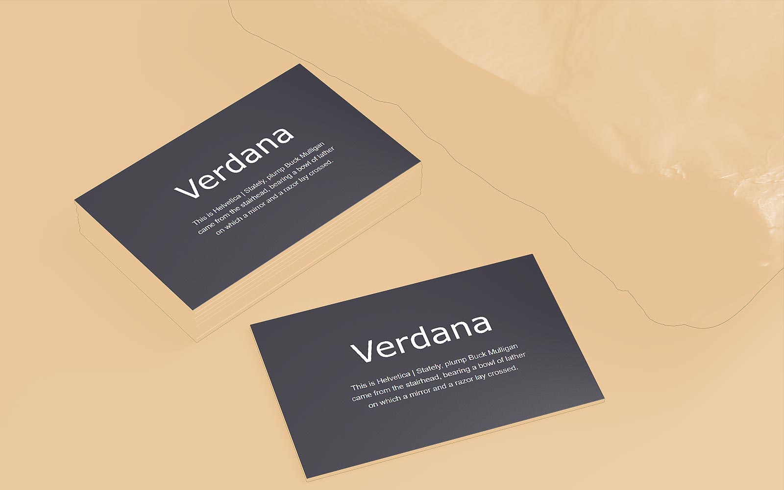
Verdana
This is Helvetica | Stately, plump Buck Mulligan came from the stairhead, bearing a bowl of lather on which a mirror and a razor lay crossed.

Verdana and Helvetica are two of the most popular sans-serif fonts. They are both highly readable, and they have a similar clean and modern aesthetic. However, they also have some key differences. Verdana is slightly wider and heavier than Helvetica, which gives it a more solid feel. Helvetica, on the other hand, is thinner and more elegant. When used together, these two fonts can create a polished and professional look. Verdana’ssolidity can add weight to Helvetica’s sophistication, or Helvetica’s refinement can add contrast to Verdana’s sturdiness.
Font Pairings | Garamond and Baskerville
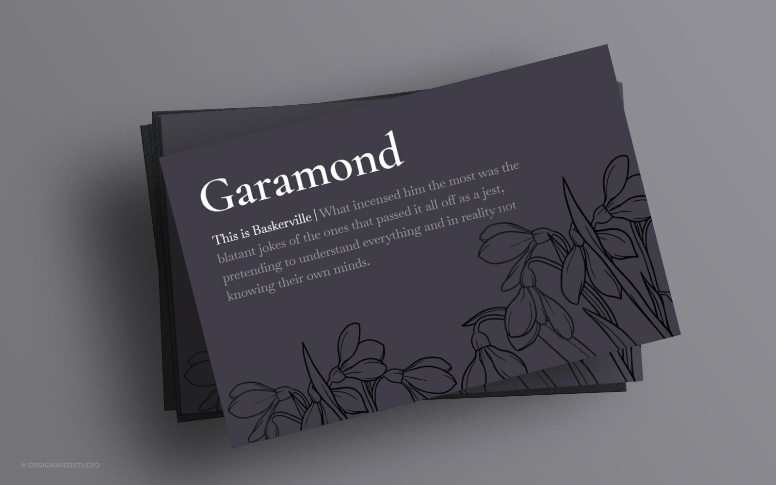
Garamond
This is Baskerville | What incensed him the most was the blatant jokes of the ones that passed it all off as a jest, pretending to understand everything and in reality not knowing their own minds.

The classic combination of Baskerville and Garamond is a popular choice for many designers. The two fonts share similar features, such as elegant serifs and an overall traditional feel. However, they also have enough personality to set them apart from each other. As a result, they create a beautiful contrast that is both eye-catching and easy to read. Plus, their timeless appeal means that they will never go out of style. So if you’re looking for a chic and timeless font pairing, Baskerville and Garamond is always a good choice.
Font Pairings | Trebuchet and Tahoma
Trebuchet
This is Tahoma | Mild fire of wine kindled his veins. I wanted that badly. Felt so off colour. His eyes unhungrily saw shelves of tins: sardines, gaudy lobsters’ claws. All the odd things people pick up for food. Out of shells, periwinkles with a pin, off trees, snails out of the ground the French eat, out of the sea with bait on a hook.
Trebuchet is a strong and modern font, while Tahoma is a more playful and classic font. Together, they provide an ideal balance for design work. The Trebuchet font family is available in a wide range of styles, from light to bold, making it very versatile. The Tahoma font, on the other hand, is only available in one weight, but it comes with a wide variety of alternate characters. This pairing provides a great deal of flexibility for designers looking to create unique and eye-catching designs. Both fonts are available for free download from the Google Fonts library.
Font Pairings | Didot and Bodini
Didot
This is Bodoni | Silly fish learn nothing in a thousand years. If you didn’t know risky putting anything into your mouth. Poisonous berries. Johnny Magories. Roundness you think good. Gaudy colour warns you off. One fellow told another and so on. Try it on the dog first. Led on by the smell or the look. Tempting fruit. Ice cones. Cream. Instinct. Orangegroves for instance. Need artificial irrigation. Bleibtreustrasse. Yes but what about oysters.
The fonts Didot and Bodini are often used together because they have a similar feel. Both fonts are serif fonts with strong, clean lines. However, they have different personality traits. Didot is a classic font that exudes sophistication and refinement, while Bodini is a modern font with a bolder, more energetic style. When paired together, these two fonts create a look that is both classy and chic. They are often used for fashion and lifestyle brands as well as luxury goods. Didot’s clean lines and Bodini’s strong serifs create a look that is both classic and modern.
Gilda Display
This is Alegreya Sans | He had a good slice of luck, Jack Mooney was telling me, over that boxingmatch Myler Keogh won again that soldier in the Portobello barracks. By God, he had the little kipper down in the county Carlow he was telling me…
Gilda Display is a stunning serif font that adds elegance and sophistication to any design, while Alegreya Sans is a clean and modern sans-serif that provides a nice contrasting counterpoint. Together, these two fonts create a look that is both stylish and easy to read. Plus, they work well together at a variety of different sizes, making them versatile and adaptable.
Antic
This is Actor | Unsightly like a clot of phlegm. Filthy shells. Devil to open them too. Who found them out? Garbage, sewage they feed on. Fizz and Red bank oysters. Effect on the sexual. Aphrodis. He was in the Red Bank this morning. Was he oysters old fish at table perhaps he young flesh in bed no June has no ar no oysters.
Antic and Actor are two fonts that were designed to work well together. Antic is a sans-serif font with a humanist touch, while Actor is a slab serif that is slightly more formal. Both fonts have a low contrast and are highly readable at small sizes. When used together, they create an elegant and refined feeling. The Antic font can be used for body text, while Actor can be used for headlines or other attention-grabbing elements. Together, these fonts convey a feeling of sophistication and refinement.
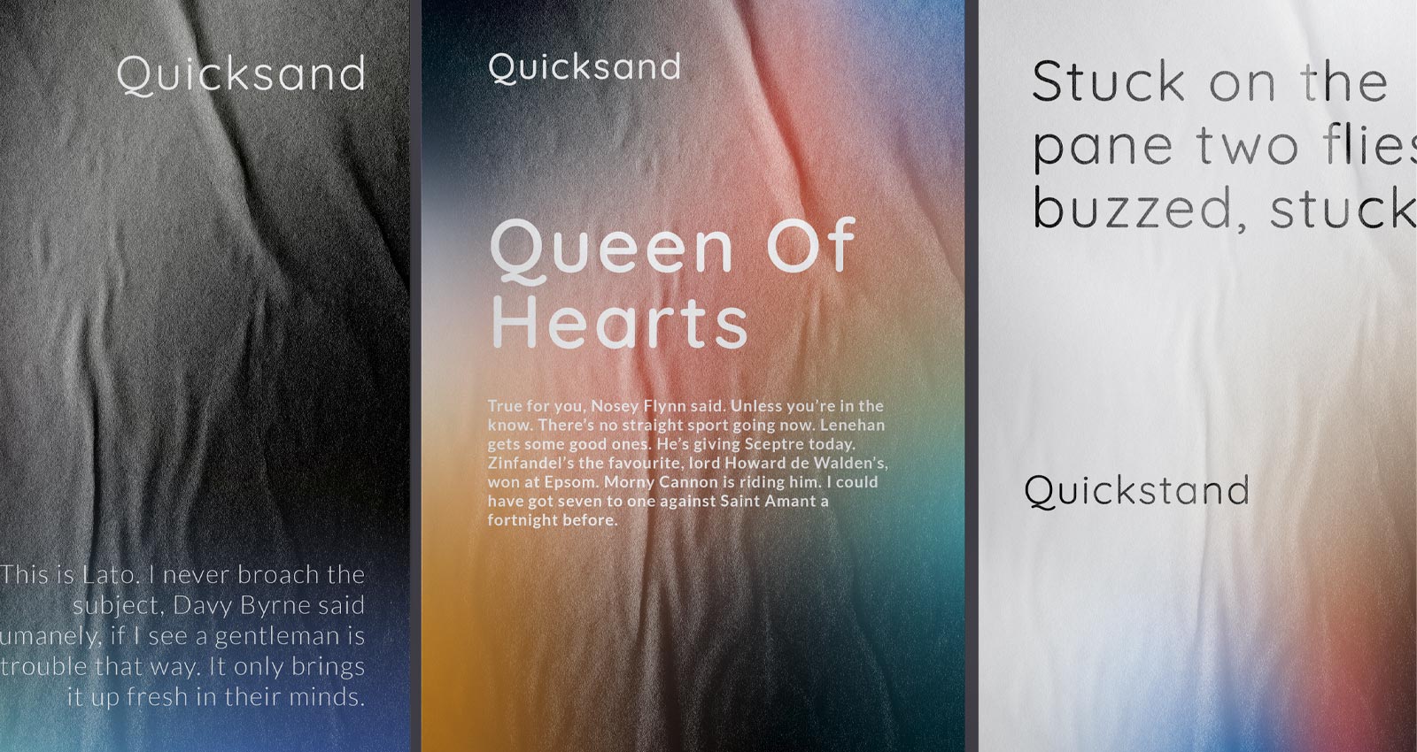
Quicksand
This is Lato 300 | Mr Bloom, champing, standing, looked upon his sigh. Nosey numbskull. Will I tell him that horse Lenehan? He knows already. Better let him forget. Go and lose more. Fool and his money. Dewdrop coming down again. Cold nose he’d have kissing a woman. Still they might like. Prickly beards they like. Dogs’ cold noses. Old Mrs Riordan with the rumbling stomach’s Skye terrier in the City Arms hotel. Molly fondling him in her lap. O, the big doggybowwowsywowsy!

Quicksand is a sans-serif font with a unique hand-drawn feel, while lato is a clean and modern serif font. Together, these fonts create a stylish and sophisticated look that is perfect for web design, branding, and print collateral. When used together, quicksand and lato create a look that is both classic and contemporary, making them an ideal choice for any project. It can turn a good design into a great one, and it can take a boring document and make it visually exciting.
Font Pairings | Bona Nova and Space Grotesque
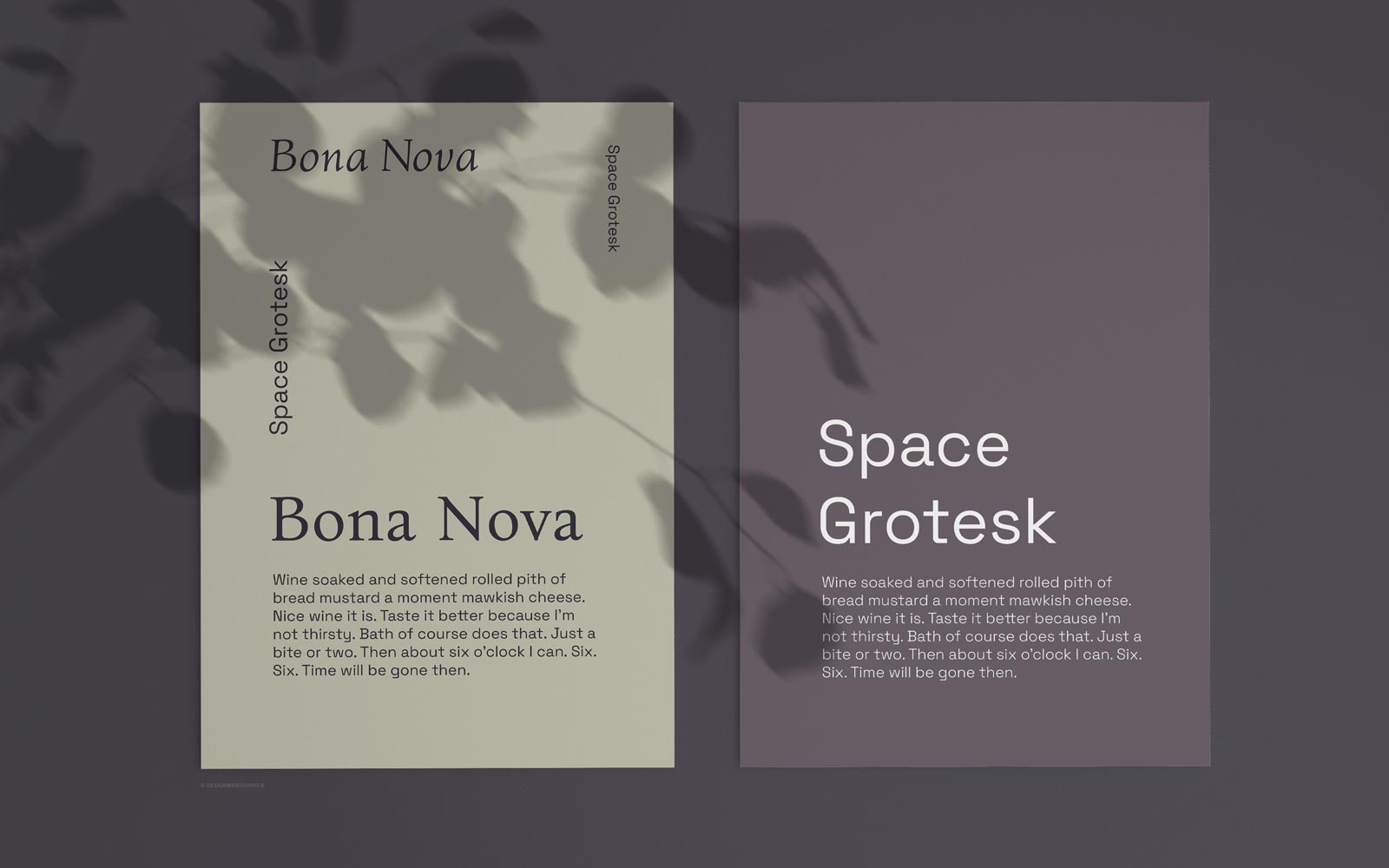
Bona Nova
This is Space Grotesque 300 | Wine soaked and softened rolled pith of bread mustard a moment mawkish cheese. Nice wine it is. Taste it better because I’m not thirsty. Bath of course does that. Just a bite or two. Then about six o’clock I can. Six. Six. Time will be gone then.

While Bona Nova is a serif font, Space Grotesque is sans serif, which gives the pairing a nice contrast. The two fonts also share similar proportions, which helps to create a sense of harmony. In addition, the slightly condensed letterforms of Space Grotesque help to give the overall design a feeling of solidarity. Ultimately, this tried-and-true pairing is a great choice for any project that needs a touch of personality.
Font Pairings | Belgrano and Neuton Sans
Belgrano
This is Neuton | Sans Sardines on the shelves. Almost taste them by looking. Sandwich? Ham and his descendants musterred and bred there. Potted meats. What is home without Plumtree’s potted meat? Incomplete. What a stupid ad! Under the obituary notices they stuck it. All up a plumtree.
Two fonts that always work well together are Belgrano and Neuton Sans. Belgrano is a strong, serif font that commands attention. Neuton Sans is a clean, sans-serif font that is versatile and easy to read. Together, these two fonts create a classic and sophisticated look that is perfect for any situation. In addition, they are both extremely versatile fonts that can be used for a variety of purposes. Whether you’re creating a formal document or a casual flyer, Belgrano and Neuton Sans will always give you a polished and professional result.
Conclusion
Pairing sans serif with serif fonts is a classic choice that always looks chic. For a modern twist, try pairing a thin sans serif with a bold slab serif. Or for a more vintage feel, try an ornate serif with a simple sans serif.
Another always popular choice is to pair script fonts with a more blocky sans serif. This contrast creates an elegant and stylish look that is perfect for weddings or invitations. For a fun and playful look, try pairing two handwritten fonts. This is a great choice for kids’ birthday party invitations or other fun projects.
Ultimately, there are no hard and fast rules when it comes to font paitings. Just remember to keep contrast in mind and to let each font shine in its own way. With these tips in mind, you’ll be well on your way to creating stunning designs that will impress your clients and leave a lasting impression.
While having an online presence is essential, converting website visitors into actual inquiries requires a strategic approach. In this article, we will explore effective ways to en
There are various grants and funding opportunities available in Ireland to support website development and other digital initiatives. However, the availability of specific grants c
Two fantastic options for creating and overseeing e-commerce websites are WordPress and Shopify. Each platform boasts distinctive features and capabilities, tailored to diverse nee
Just as a well-designed building seamlessly integrates with its surroundings, an exceptional website should harmonise with its content and purpose. We’ll examine how these we
Print design remains an essential facet of graphic design that encompasses various mediums such as brochures, posters, magazines, and packaging. Unlike digital design, print materi
Simple web design not only enhances user experience but also fosters a sense of clarity, elegance, and efficiency. Let’s explore the art of keeping it simple in web design an
A visually engaging and aesthetically pleasing design not only captures the attention of visitors but also helps in building a strong brand identity. By incorporating a cohesive de
A brand style guide is an indispensable tool for ensuring consistency and coherence in how a brand presents itself to the world. It serves as a foundation for brand identity, empow
In the world of web design, creating an aesthetically pleasing and functional website is paramount. However, the most successful web designers understand that design goes beyond ae
Whether it’s a corporate office, a museum, a retail store, or a public park, the design of these spaces has a profound impact on our well-being and how we perceive and intera
Minimal website design Examples A Brief Introduction to Minimal Website Design & Some Examples Fashion minimalistic design Grid-based minimalistic website Minimal Makeup &
Font Pairings For Brand Ten featured font pairings to enhance your website brand Fonts are a crucial part of any design, and the right pairing can make all the difference. But wit
Your digital success story starts here
![]()